Iconic Digipak's usually consists of the following:
- Iconic headshots featuring the artists' face
- Iconic graphic designs
- Usually consists of 4 creative panels
- Front cover
- Tracklistings
- An iconic image
- Will commonly feature 6 panels
The Digipaks that I have chosen to analyse is Rihanna's ANTI album, Lady Gaga's THE FAME MONSTER album and David Guetta's ONE MORE LOVE.
Rihanna - ANTI (2016):
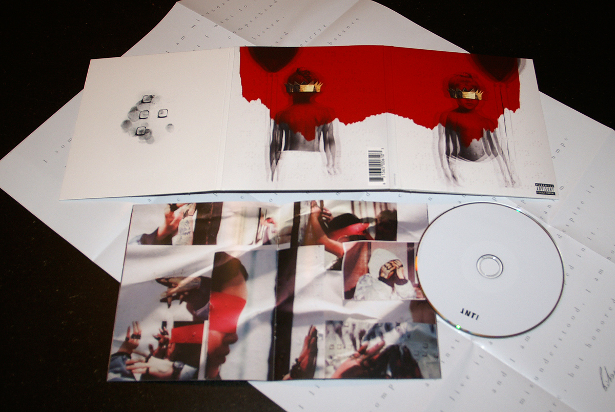
Rihanna's ANTI album is a good and clear example of Digipak's being used in the current music industry. This follows the conventions of a successful and clear to see Digipak as it features roughly 6 panels, along with the content of a signed A3 sheet from Rihanna herself, also along with a photo gallery and the CD itself. Furthermore, it features an iconic front cover despite not having the artist herself featured on the front. What's also very interesting about this album's Digipak is that the title of the album and the name of the artist isn't at all apparent, which shows how unconventional this Digipak is compared to a standard and conventional Digipak.
Lady Gaga - THE FAME MONSTER (2009):

Lady Gaga's THE FAME MONSTER is a good example of a generic Digipak within the pop music industry. It features an iconic head shot image of the artist herself, along with the tracklisting located at the back of the Digipak, the CD located inside of the Digipak and a photo gallery of a photoshoot from the artist to help sell her image. What makes this Digipak feel more exclusive to the consumer, the font on the front cover which reads "Lady Gaga The Fame Monster" is printed in the colour of gold, whereas the general and standard CD case version of the same album is just printed in white. This allows the consumer to then feel more exclusive with the artist due to this reason.
David Guetta - ONE MORE LOVE (2009):


David Guetta's ONE MORE LOVE album is also another example of conventional Digipak. The typography used for the name of the title of the album is almost drawn on with the effect of paint, connoting to the audience and the consumers that there is a laidback and relaxed amount of effort from the artist, but - also connotes artistic. The iconic head shot featured for the front cover is in black and white in contrast to the overflow of paint on the tracklist and the rest of the Digipak.
No comments:
Post a Comment